
<div class="container">
{if isset($_items)}
{foreach from=$_items item="item"}
{if $item@first || ($item@iteration % 4) == 1}
<div class="row">
{/if}
<div class="col3{if $item@last || ($item@iteration % 4) == 0} last{/if}">
<a href="{jrGallery_get_gallery_image_url item=$item}" title="@{$item.profile_url}: {$item.gallery_alt_text}" target="_blank"><br>
{jrCore_module_function function="jrImage_display" module="jrGallery" type="gallery_image" item_id=$item._item_id size="larger" crop="square" class="img_scale" style="margin:0" alt=$item.gallery_image_name}
</div>
{if $item@last || ($item@iteration % 4) == 0}
</div>
{/if}
{/foreach}
{/if}
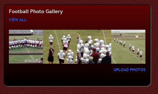
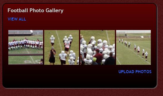
</div>I am trying to do TWO things actually
1-I would like a slight space between each of the images so they do not run together
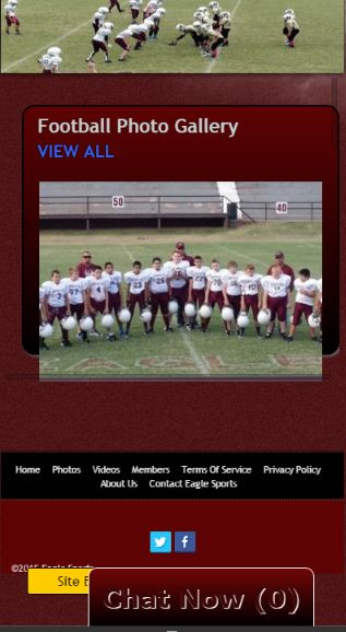
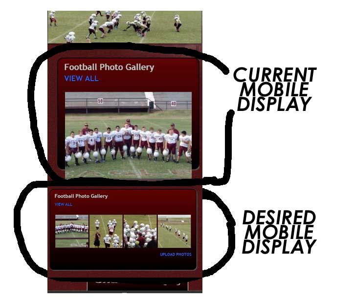
2-I would like the images (all 4) to display this same way on mobile devices. Currently they display on mobile devices as a single column of 4 images which breaks them out below the css I am using to style them with
How do i get a slight space between each image- then how to get this template code to display as 4 across on mobile devices?
NOTE- at one time I was able to get them to stay 4 wide on mobile devices by adding some form of pagination...but now I cannot reproduce that-my preference would be to display as in the screenshot without the pagination
I am open to any suggestions/advice
I am stumped
updated by @derrickhand300: 02/16/16 11:26:46AM